9 Essential Business Card Design Tips for a MemORable Impression
Imagine handing someone a small piece of art that encapsulates the soul of your business. A business card isn’t just a scrap of paper—it’s your personal ambassador in a competitive marketplace. In today’s dynamic business environment, where trust and clarity are paramount, a well-designed business card can make a world of difference. As you embark on this creative journey, allow me to guide you through each crucial step, illuminating both the opportunities and potential pitfalls associated with your design decisions.
1. Begin with a Logo that Speaks Volumes
Your logo is the visual heartbeat of your brand. When it comes to business cards, it’s essential that your logo remains impactful, even when scaled down. Think of it as a tiny beacon that must capture attention from afar. If your logo has intricate details or an overabundance of text, it might lose clarity when reduced to business card size. In these circumstances, consider a simplified or alternate version dedicated solely for small-scale applications on stationery, letterheads, and promotional materials.
This decision is not simply cosmetic—it speaks to the very essence of your business identity. A clear, memorable logo can evoke positive emotions and help instill trust. Always ask yourself: Does my logo retain its power when shrunk down to the size of a business card? If not, it’s time for a redesign. It might be helpful to consult with a graphic design expert who can ensure that your logo is versatile enough for all uses.
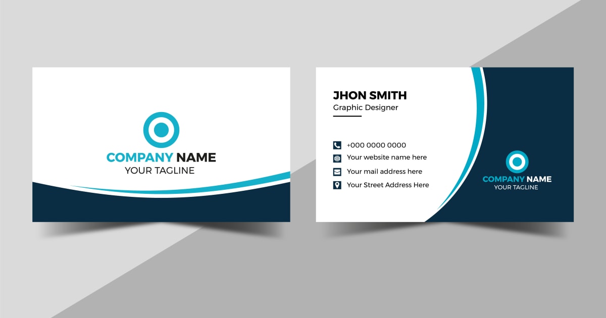
2. Curate Only the Essential Information
A business card has limited real estate, so each element on it must earn its place. Think of your card as a finely tuned elevator pitch, where every word and symbol counts. Essential information includes:
- Company logo and name: These are your brand’s hallmarks.
- Your name and title: Personalize the card and establish credibility.
- Contact details: A physical address (if relevant), phone number, and email address.
- Website URL: Direct prospects to learn more about your offerings.
- Company slogan or tagline: A short phrase that encapsulates what you do best.
Every element should work in harmony to tell your brand’s story without overwhelming the receiver. Overcrowding can lead to confusion and, worse yet, be quickly forgotten. It is similar to trying to remember a long, convoluted sentence compared to a short, catchy phrase that remains etched in your memory.
3. Embrace a Clean, Businesslike Font
Typography is more than a style choice—it is a subtle language that communicates professionalism. The right font can reinforce your brand’s image, while an excessive number of typefaces can create visual chaos. For most businesses, sans serif fonts are the go-to choice because they are modern, easy to read, and versatile. Limit your design to one or two fonts; consistency is key.
Consider the analogy of a well-rehearsed orchestra: every instrument must play in harmony, and too many soloists can disrupt the melody. Similarly, your business card should be a symphony of clear, no-nonsense typography that the recipient can quickly absorb without any mental clutter.
4. Let White Space Work for You
While it might be tempting to use every inch of your card’s surface, white space (or negative space) is a powerful design tool. This space can significantly enhance readability and create a modern, sophisticated look. Think of white space as breathing room for your content—it gives your eyes a chance to rest and focuses attention on the elements that matter most.
Overcrowding a card can diminish its impact, much like a busy storefront that confuses potential customers. Instead, purposefully design your card with ample white space to enhance the overall aesthetic and make important details stand out.
5. Choose Colors that Complement and Enhance
Color is arguably the most emotional aspect of design. The right palette can communicate energy, stability, creativity, or warmth—qualities you want associated with your business. However, be cautious: bright and garish colors might capture attention but can also be off-putting if not balanced correctly. For example, a combination like a red border with extensive gold text on a black background might appear impressive at first glance but can compromise readability.
On the other hand, subtle contrasts with a bold accent can achieve an elegant yet functional design. Reflect on what emotions you wish to invoke: calm, excitement, reliability? Consider testing various color schemes with trusted colleagues or potential clients. When done well, color is your secret weapon in creating an emotional connection with a prospect.
6. Tailor the Design to Your Business Niche
Your industry plays a significant role in how you should approach your business card design. Financial institutions, legal professionals, and healthcare providers typically benefit from a subdued, formal style—a clean, minimalist layout that exudes trust and reliability. However, if you’re in a creative field such as graphic design, fashion, or marketing, you’re free to experiment with unique layouts, bold imagery, or even including a professional photograph of yourself.
This decision should be strategic. Your business card is an extension of your brand identity. Reflect on how your target audience perceives you and design accordingly. Overdesigning or underdesigning can lead to misinterpretation of your brand values. For those venturing into new business structures like an LLC, it’s also wise to explore resources like BizForm’s comprehensive LLC guide to ensure your image and legal compliance align perfectly.
7. Utilize the Backside for Added Value
Many designers limit their creativity to the front of the card, but the back can be a treasure trove of potential. Instead of leaving it blank, think of a way to offer additional value. This could be a useful chart, a pertinent quote, or contact information for services such as banking support that your clients might require.
For example, if you are a realtor, you could include a quick reference table of mortgage rates. If you’re a tech entrepreneur, perhaps a QR code linking directly to your portfolio or professional social media profiles might be perfect. The goal is to transform your card from a static piece of information into a dynamic tool that keeps your business top-of-mind. Offering a unique piece of content on the reverse side encourages clients to hold on to your card, ensuring future interactions.
8. Choose the Right Card Stock and Finish
The tactile experience of a business card greatly influences how it is remembered. The weight, texture, and finish of your card stock speak volumes about your brand’s quality and attention to detail. Glossy finishes can highlight vibrant colors and images, but they may make writing on the card nearly impossible if the recipient wishes to add a note. A matte finish, in contrast, often exudes sophistication and is easier to annotate.
In some cases, innovative options like dual-textured cards or even magnetized cards can create a lasting impact. Particularly for service-based industries where frequent recall is crucial, these tactile elements are more than just surface decoration—they are a strategic component of your brand’s identity. Services like BizForm’s operating agreement support understand that every detail counts when building trust with clients.
9. Know Where to Turn for Professional Help
If the world of graphic design feels overwhelming, remember that you don’t have to navigate it alone. There are various avenues available that can transform your ideas into a stunning visual reality without breaking the bank. Online platforms like Vistaprint or Freelancer sites such as Upwork allow you to access a pool of talented professionals who can help craft your perfect card.
Additionally, many software programs offer premade templates that can be customized to suit your needs. Whether you work with Adobe products or even Microsoft Word, starting with a proven design can provide confidence and a professional finish. Choosing the right service means understanding your needs and aligning them with the provider’s expertise—just as when considering other important business services like tax services for your company.
At this point, you might be wondering how to balance creativity with practicality. The world of business card design mirrors the delicate balance of a tightrope walk—too much emphasis on artistic flair might distract from clarity, while an overly cautious approach can seem uninspired. The secret lies in blending functionality with aesthetic appeal so that the final product is both unforgettable and effective.
FAQ's on Business Card Design
Q1: How do I decide which information is absolutely necessary on my business card?
A1: The ideal business card should include only essential information: your logo, name, title, primary contact details, website, and a succinct tagline. Think minimalist yet complete—each element should actively support your brand story without cluttering the design.
Q2: Can I incorporate a photo of myself on my business card?
A2: Absolutely. Including a professional headshot can be very effective—especially if your business thrives on personal relationships or face-to-face interactions. However, consider your industry. For example, creative professionals might benefit from a more visually dynamic design, while more formal sectors might prefer a traditional layout.
Q3: What should I consider when choosing the card stock?
A3: Card stock plays a significant role in the tactile and visual appeal of your business card. Options include matte finish for a sophisticated look, glossy finish for vibrant imagery, or even dual-sided finishes. Additionally, heavier card stock typically feels more premium and credible. Evaluate your audience’s expectations and choose accordingly.
Q4: How important is the color scheme in my business card design?
A4: Extremely important. Your chosen colors are not only about aesthetics—they communicate your brand’s personality and core values. While bright colors may stand out, they should be used judiciously to maintain readability and a professional vibe. Balance is key: opt for a palette that resonates emotionally with your target audience without sacrificing clarity.
Q5: Where can I find professional help if I’m not confident in my design skills?
A5: There are several affordable and professional options available. Online printing platforms, freelance graphic designers on sites like Upwork, or even pre-designed templates available in common software suites offer excellent support. Services such as BizForm’s registered agent services also provide an overall framework ensuring that all your brand materials, including business cards, meet high standards of professionalism.
Conclusion and Key Action Points
Creating a business card that serves as a powerful extension of your brand requires both creative insight and practical planning. From selecting a clear and memorable logo to choosing the right touchpoints in design—every decision plays a vital role in building the trust and recognition your business needs to thrive.
- Focus on Simplicity: Prioritize essential information and avoid overcrowding the design.
- Design with Intent: Ensure every design element, from typography to color, aligns with your brand ethos.
- Maintain Readability: Use ample white space and simple fonts to keep your message clear.
- Tailor Your Approach: Customize design choices based on your industry and target audience.
- Add Value: Utilize the back of the card to offer useful information that encourages retention.
- Invest in Quality: Choose high-quality card stock and finishes that reflect the premium nature of your brand.
- Seek Professional Support: Don’t hesitate to rely on expert services to ensure your business card shines, much like the comprehensive solutions provided by BizForm for all your company’s needs.
Remember, your business card is often your first handshake with the world—make sure it leaves a lasting and positive impression that speaks to the warmth, reliability, and expertise of your brand.